WEBSITE & LOCAL SEO / CASE STUDY 05
Himalayan Club
A bold identity with flavour at its centre.
A restaurant website combining detailed food and drink content, original illustration and connected local SEO foundations.
- Website featured
- Himalayan Club
- Project type
- Website & local SEO
- Our focus
- Expressive typography & structured food content
01 / THE APPROACH
Build a food story with more than atmosphere.
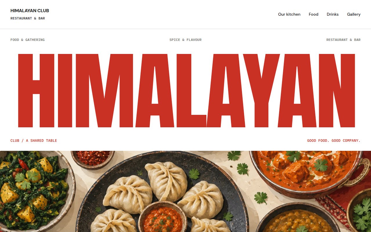
The Himalayan Club website starts with a strong name and a clear subject: food, spice and a shared table. We paired the expressive opening with content that explains the role of aroma, texture and freshness in a meal.
That subject carries through the site without needing an owner story or a history of the premises. The business voice comes from the approach to food and drink, with enough detail to make the pages useful beyond the first screen.
02 / WEBSITE BUILD
A bold homepage, then a more focused reading experience.
The homepage moves from the large wordmark and food illustration into the kitchen, the table and the relationship between food and drink. Supporting food and bar pages give those topics their own space. A separate gallery brings the original artwork together.
The food page covers dumplings, layers of spice, vegetables, rice and bread, with a section on ingredients and dietary considerations. The drinks page explores balance, alcohol-free flavour and pairing. In-page navigation helps readers move through the longer sections without losing their place.
03 / LOCAL SEO
Make the relationship between pages explicit.
The local SEO foundations start with distinct page purposes. Food, drinks and the gallery each have descriptive titles, their own canonical URL and a place in the sitemap. Navigation connects those pages directly rather than leaving useful information buried behind an image.
The copy is delivered in ordinary HTML with a clear heading hierarchy. The artwork has descriptive alternatives, and the site identity is consistent across visible copy and metadata. These decisions make the website easier to understand without introducing unsupported review or ranking claims.
04 / VISUAL DIRECTION
Original artwork with a recognisable rhythm.
Food, drinks and a celebration table form a connected set of original illustrations. Their colours work with the red-and-white identity, while captions describe the artwork plainly.
Large display type gives the site its character, but the supporting copy uses a quieter reading style. That contrast lets the homepage be expressive while the longer food and drink pages remain practical to use.
THE WORK IN PRACTICE
The outcome.
A recognisable identity
The wordmark, red palette and original artwork work together.
Substantial supporting content
Dedicated food and drinks pages develop the homepage topics.
Connected local SEO foundations
Clear metadata, HTML content, canonicals and direct page links.